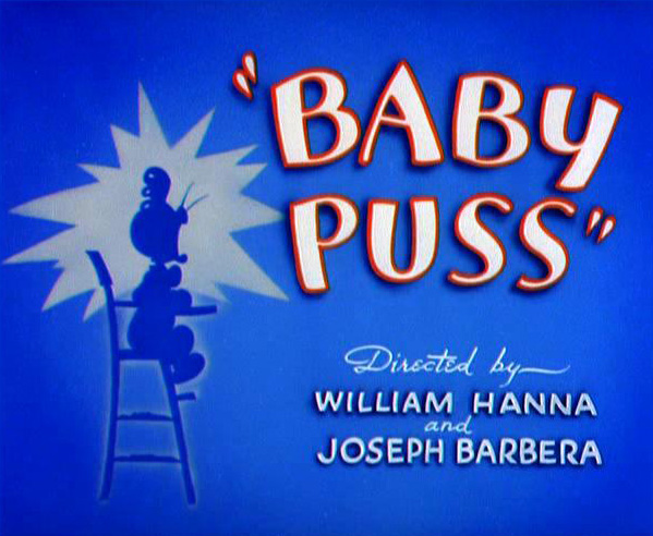
Tom & Jerry's title cards were often quite simple with flat colour or two-tone backgrounds. Characters, when used, were often silhouetted against the backdrop.
The majority of title cards seemed to be predominantly blue or green.
I'm not entirely sure why — was it a stylistic choice or more to do with
production limitations? There were a small number of cards that were
warmer in hue, but they seemed to be much simpler in composition with
little to no artwork at all. Notably, the title card for "Push Button
Kitty" was a simple orange radial gradient with just the episode title
and production credits.
Some cartoons, such as Dick Dastardly & Muttley in Their Flying Machines, would use the same title card artwork for each episode.
Chip 'n' Dale didn't even have a card at all — the episode title was simply displayed during the establishing shot. This would definitely be something to consider in the event that having a static title card causes me to go over time.
Quick brainstorm for some potential titles to use. Titles are something I always struggle to come up with, but I think I've finally hit on the delightfully cheesy "Window Pain." (Oh, that's terrible…)
I love the simple composition of the FairlyOdd Parents and Tom &
Jerry's cards and it's something I'd like to integrate into my own work.
I'm planning on a very limited palette — black or navy blue, with white
text.
I don't want to get too extravagant with it at this point. A good title card is important, but I'm not going to fret too much over it at this stage. I don't really want to spend hours on it only to discover that oops, my animation's 55 seconds long. |f everything slots together comfortably and I have time left at the end, I may go back and tart it up a bit. But I think it's functional at this stage.


No comments:
Post a Comment