Sunday 30 October 2011

Polished storyboards

I actually finished these about a week ago, but for some reason I've only just gotten around to uploading them. Whoopsie!


They're a bit iffy but it's mostly all there! Drawing these flagged up quite a few problems with the initial composition in some of the shots, mostly in the position of the window behind Craig. It was a bit too low initially so when he sat at his desk his head blocked most of the view, meaning you wouldn't have been able to see what was going on outside. There's a couple of problems with the desk as well — when Craig goes to shut the curtains he overlaps the desk with his leg a bit. I've managed to sort-of rectify this by shifting it to the right a little bit but it could do with some further tweaking. I might need to rethink the set placement again if it proves to be too much of an issue, but so far I think this will work. My next aims are to finish my final puppets and put together a better animatic with sound, which should give me a much clearer indication as to the length.

Friday 28 October 2011

Title cards planning & research

Trying to figure out a design for a title card — I love the style of the title cards in old Hanna-Barbera cartoons, particularly Tom & Jerry which had some really beautiful art. I've been looking at some of those for some inspiration in terms of colours and composition.


Tom & Jerry's title cards were often quite simple with flat colour or two-tone backgrounds. Characters, when used, were often silhouetted against the backdrop.


The majority of title cards seemed to be predominantly blue or green. I'm not entirely sure why — was it a stylistic choice or more to do with production limitations? There were a small number of cards that were warmer in hue, but they seemed to be much simpler in composition with little to no artwork at all. Notably, the title card for "Push Button Kitty" was a simple orange radial gradient with just the episode title and production credits.


Some cartoons, such as Dick Dastardly & Muttley in Their Flying Machines, would use the same title card artwork for each episode.


Chip 'n' Dale didn't even have a card at all — the episode title was simply displayed during the establishing shot. This would definitely be something to consider in the event that having a static title card causes me to go over time.


Quick brainstorm for some potential titles to use. Titles are something I always struggle to come up with, but I think I've finally hit on the delightfully cheesy "Window Pain." (Oh, that's terrible…)


I love the simple composition of the FairlyOdd Parents and Tom & Jerry's cards and it's something I'd like to integrate into my own work. I'm planning on a very limited palette — black or navy blue, with white text.


I don't want to get too extravagant with it at this point. A good title card is important, but I'm not going to fret too much over it at this stage. I don't really want to spend hours on it only to discover that oops, my animation's 55 seconds long. |f everything slots together comfortably and I have time left at the end, I may go back and tart it up a bit. But I think it's functional at this stage.

Monday 24 October 2011

After Effects tutorial day 1

Our first After Effects workshop was a very gentle introduction to the interface and some of the basic tools and preset effects. After Effects is much less scary when you have somebody to hold your hand through it!

We were given several pieces of footage (A DJ, a coloured background and some text that we'd created within Photoshop and imported) and a basic soundtrack and shown how to combine them into one composition. We were introduced to keyframes which allowed us to apply some very simple animation to the text layer.

Today's instruction resulted in this monstrosity:


Disregarding my flagrant abuse of lighting effects, I did find the lesson very helpful in familiarising myself with After Effects' initially terrifying interface. I'm not confident with it by any stretch of the imagination but I'm at least comfortable enough to open the program without running away and screaming.

Tuesday 18 October 2011

Background mockups

Spent mos of today putting together some experimental backdrops. I'm relying mostly on Google Images and sxc.hu for all the pieces; the selection of hi-res stock images is horrifically limited, making it quite difficult to find parts that all fit together.

Click for full size

Click for full size

These are really just mockups to test composition. I still need to add some missing objects, background details and make a lot of lighting adjustments but I think I'm beginning to get something workable!

Sunday 16 October 2011

Rough storyboards and animatic test

Chatted to Andy on Friday about my ideas so far and it was generally pretty positive, so I'm pleased about that! The only thing that struck me afterwards is that my idea was composed of one long, continuous shot as opposed to containing 5 cuts as specified in the brief. This caused me a bit of panic at first as I wasn't sure how I'd be able to work in different camera angles without losing the visual gags. Luckily, after some experimentation, I was able to combine the cuts of an earlier idea with the current narrative structure with some success. This is what I ended up with:

Click for full size

This is by no means the finished storyboard — I'm working on that right now — I really just want to do as many thumbnails as possible to allow me to jiggle things around and explore every which way before starting something mor refined.

The other thing I was concerned about was the length; the very last thing I want is to discover at the last possible minute that I've way overshot the mark. I used the very finest tools (my webcam and Windows Movie Maker) to craft this elaborate animatic:


An Oscar winner to be sure!!

This is clearly only a tentative animatic (if you can call it that) — I'll be producing a much cleaner one later — I just wanted to give myself a rough idea of the length. I doubt it's completely accurate but at least I know that, at this point, I'm safely within the time constraints. If, by the time of the completed animation, I find that it's too long, I can safely cut one of the scenes and still have a coherent narrative.

Friday 14 October 2011

"Some Jokes Grow Old" cutout animation


Found this on Youtube. It's not completely seamless but I absolutely love the visual style, particularly in the first couple of scenes with the barman and the horse. The faded, sepia tone might be something I could try and replicate in my own work.

I might be able to give it a sort of 70s/80s-style TV treatment and make it look a bit retro. Faded colours, slightly iffy sound, bit of a crackle - that kind of thing?

Quick tutorial with Jon and some more materials

Chatted with Jon briefly this morning about my ideas so far and it helped a great deal. He suggested that my idea might potentially be cutting it a bit fine in terms of complexity and time which is something I was really concerned about. Fortunately I do have a much more simplified version of my idea that he seemed to think would work much better - having Craig working away at his desk but constantly distracted by noises outside. Every time he looks up there's a different scene going on outside his window.

He liked my early cutout puppets and suggested that I carry on working with them a bit more, adjusting the feet and back of the side-view head to clean it up a bit. He gave me some ideas in terms of building backdrops, layering photographs and fitting them together, perhaps using pixilation techniques for some of the live-action scenes.

He suggested putting together some mood boards in my sketchbook to help establish the visuals for my animation, looking at Stanley Pickle and the British Gas TV commercials for some inspiration in terms of aesthetics.


It's very similar to what I've put together so far, and it sounds strange but I find looking at the necks and heads really helpful. The problem I had with the side-view puppet was trying to fit the neck to the head without it looking peculiar. I just sort of stuck a skinny pole up through the chin and cut off the back of the head, so it looks a bit odd. I can use these commercials to get more of an idea on how I should build my puppets.

Thursday 13 October 2011

Quick 'n' dirty puppet tests


Knocked together a couple of very quick and rough puppet test ideas. Going for something of an Angela Anaconda vibe. I'm not too keen — not quite sure what but something just bothers me. I think it's because at this stage I still don't really know what I'm aiming for in terms of character design. Its difficult to do anything satisfactory when you lack a clear idea of what you want.

At least I'll have something to practice with in tomorrow's lesson, though. Maybe seeing things in motion will give me some ideas.

Angela Anaconda/Blue's Clues

I was never really a fan of Angela Anaconda as a kid. It's a bit like something out of a bad dream and always made me feel a bit ill, but it uses a really interesting style of cutout animation and is really quite cleverly done. I thought that there might be something I can draw from this regarding character design.


The clothes and most set pieces are really simple cutout objects. The faces and limbs are simply greyscale photographs, with only distinguishing features (freckles, hair) in colour. It's a really interesting contrast and is actually quite attractive in a baroque way.

I may be able to produce something similar — if I were to make a simple body for a puppet in Photoshop with each limb on a separate layer I would be able to pin them all together digitally and superimpose a photograph to use as a head or hands, etc.

Blue's Clues is another great example:


It was a pretty ridiculous programme but very effective visually. It's a fantastic demonstration of live action and cutouts working together pretty seamlessly and creating this entire other world that was, for the most part, quite convincing (assuming you're aged 8 and under)

Pencil Full of Lead [live action/claymation]

I've been looking at some examples of combining live action footage with animation in some form — the obvious choice is, of course, Who Framed Roger Rabbit, but one of my flatmates showed me this music video:


I wasn't particularly impressed at first — the clay model is a bit crude and the music's not really my bag. I found it a bit difficult to really get the point, but once the dancers start slapping him around and pulling bits off it quickly becomes quite an effective piece of slapstick with some interesting character sequences. I like how it's quite self-aware — they all know he's a clay model and play on that. It's certainly not the first time or most effective way that it's been done but it's quite entertaining none the less.

Wednesday 12 October 2011

Character design ideas

I did some more quick sketches of Craig from the photos I took to try and get more of a feel for his character — posture, face shape etc so I could start trying to figure out something of a character design.


None of these feel "right" to me — then again they're only quick pencil sketches, so it's difficult to envision how the characters and backgrounds might work together. I think it might help if I start using more colour and different materials to create mock ups of certain scenes, to demonstrate and give me an idea on how certain elements will work together.

I think maybe I'm worrying too much. All I really want in terms of a character is a little puppet-Craig, so I don't need to go completely crazy — I think I can probably get away with chopping some photographs together, maybe on some sort of drawn or edited body?

I started thinking about rotoscoping and how that might look so I did some quick traces of a couple of the photos to see how that might work.


I don't know. I think they look okay but it's not really what I'm going for. I can't see them working as animated characters. They're too stiff I think, especially compared with the sort of backdrops I'm trying to use.

I've asked Craig to send me some of his drawings that I can make puppets out of as background characters!

Tuesday 11 October 2011

Keep out sign

Click for full size
Bit of fun with Photoshop in this week's lesson; mostly just getting to grips with selection tools, brushes, text and layer styles. I downloaded a couple of grunge brushes and used them to rough things up a bit. May have gone a bit over the top! 

The doodles (and shamefully traced Godzilla) were done using a brush I downloaded quite some time ago designed to mimic the effect of a pencil. It's one of my favourite brushes for drawing because it's nice and textured!

Saturday 8 October 2011

Character design materials

Met up with Craig on Thursday to have a quick catch-up. We have frequently conflicting timetables and he doesn't live on-campus so it's been quite difficult to find a time that we're both in and available! 

I was initially apprehensive about how he'd respond to the complete 180 I'd pulled regarding my ideas, but to my great relief he seemed quite enthusiastic about everything and was very keen on the balloon in space scene. 
We had a brief amount of time before the afternoon's lecture so I was able to get some quick snapshots and drawings done so that I can start moving forward with character design.


(Sorry for the horrible quality thumbnails — Blogspot's not very good at this sort of thing)


(Click below for a few more pictures)

Friday 7 October 2011

A complete change in direction

Listening to Dolly Parton managed to set me off in a completely different direction in terms of my ideas. I'm secretly quite pleased — I felt that I was really struggling to get anywhere!


The fact that Disney characters feature so heavily in the video is an added bonus!

I thought I might be able to incorporate this song as the background soundtrack. So far I'm thinking of Craig as a struggling illustrator — working late, his radio on, and as the song plays he starts hallucinating and his drawings leap off the page and start dancing around, wreaking havoc — maybe they drag him onto the page with them and he's forced to interact with an animated landscape?

It would be an interesting opportunity to try and combine live-action with animation.

I think the idea may partially have come from the fact that I was struggling so much trying to get anywhere — workin' from 9 to 5 (and beyond) and still stuck...

Monday 3 October 2011

Inspiration in windmills

I found a couple of pictures of some silhouetted windmills on Google and they rather strongly reminded me of Lotte Reiniger's work — the striking contrast of a pitch black shape against a simple backdrop. It would be quite interesting to do all the background elements in this style, with the backdrops themselves in very soft focus with just a few colours but all large objects and set pieces silhouetted.


I'd like to with incorporating the idea of colour and silhouettes into the animation itself. I'm not entirely sure how yet — perhaps having the character interacting with the environment in some way and manipulating colours and shadows?

Sunday 2 October 2011

Digital Skills: Backdrop experimentation

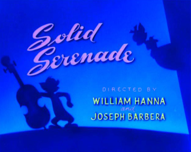
Been doing a bit of tinkering with Photoshop, taking some inspiration from the works of Lewitt-Him and Alice/Martin Provensen. I wanted to see whether I could produce a similar effect to their simplistic cutout style using digital techniques.

Click for larger view
Not altogether too happy with it. I'm fairly pleased with the trees and grass and general scenery, but I really lost my groove on the house, which came out horrendously. There was a lot of detail that was difficult to break down and I was starting to get really impatient with some technical issues (read: Photoshop throwing up an "unrecoverable error" at me every 10 minutes), so I ended up really rushing it!

I thought that having quite bold and simplistic backdrops could work quite well if I was to have quite detailed character puppets, helping to bring focus to the scene. I think the colours could stand to be a little more subdued. Though I used a relatively limited pallette it's almost quite garish and potentially distracting. Lowering the opacity might help as opposed to completely re-colouring the entire scene.


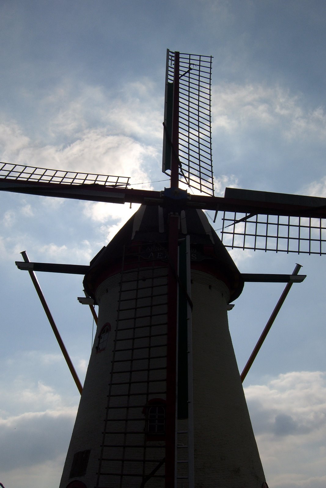
The image was quite simple (if a little time consuming) to create — the original image (above) was sourced from sxc.hu, a free stock image resource. Ordinarily, I would prefer to go out and source my own images to use, but for the purposes of a spontaneous experiment it didn't really seem worth a trip to Holland ;] Retrospectively I could have used almost any image but I thought I'd try and keep with the theme of the project!

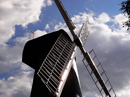
First I applied a Poster Edges filter to the image. This was to darken existing contrast boundaries and help Photoshop detect the edges of each object in the image when it came to the selection process.
 I then increased the brightness and contrast very slightly — again, to help with edge detection.
The cutout filter is one usually best avoided — in this instance, though, I found its use acceptable in order to help simplify the colours and shapes in the image, providing me a solid guideline to work from.
I then duplicated the background layer and applied a Find Edges filter to the copy. This gave a strong, distinct outline to everything in the image.

Unfortunately, in doing so, it also loses its colour information. Ideally I need the guidelines and the simplified colours/shapes from the previous layer, so I applied a Soft Light blend mode to remove the white from this layer and overlay it onto the one below.


The result is this fairly ugly but very useful image. It contains both the outlines from find edges and the simplified colours and shapes from the cutout filter, providing a perfect guide to paint over.

Because of the clear colour and edge distinction, I was able to simply use the magnetic lasso tool to make a loose selection around any area in the image. Photoshop was able to very accurately detect the edges of whatever I was selecting and mostly guided itself.
I could then just fill the selection with my chosen colour.

Lotte Reiniger

Craig mentioned Lotte Reiniger as one of his favourite animators (aside from Disney) so I've been having a look at some of her work. She was a silhouette animator and did a massive array of fairytale adaptions, which I thought was relevant!


I really love the title cards — it reminds me of Watch With Mother! Very simple and effective. This might be something I can use?

Looking mainly at the way the backgrounds contrast with the characters — again, very simple cutout shapes similar to the works of Alice & Martin Provensen and Lewitt-Him. The solid black figures against the relatively soft background is extremely striking.


If I were to go ahead with the pop up book idea, the way Lotte Reiniger animated her puppets could be something to bear in mind. In actual pop up books the character puppets are very limited in movement, often with just one or two articulated limbs — a waving arm for example — so I could make several puppets for each necessary action/expression and just flip between them?

Quick ideas

Got a lot of ideas in my head in terms of visuals, so I've started throwing some things at my sketchbook and seeing what happens. I'm trying to translate all this from sketchbook scribbles and make it slightly more coherent, so bear with me!

I'd really like to apply some of what we've been learning in animation principles — my first thought was just to have the character walking across some sort of scrolling panoramic background. In keeping with the theme of fairytales, I'm loosely thinking of a forest or some sort of castle.
I'd like to do something in a very ornate, classic style like old book illustrations — perhaps even using sepia tones and old paper textures to really replicate the feel of a children's story.

One possible idea I'm toying with is to have the title card look like the cover of an old book, with the title of the animation embellished in gold lettering (as very poorly illustrated here), then have the book open to reveal a story, which then begins to come to life across the pages.

Thinking in terms of a pop up book — each time the page turns they kind of spring upwards from the page. Their movement would be intentionally kept very 'puppety' and articulated.

I then got to thinking that it would probably make sense for things to take place in Holland — Craig's listed 'favourite or special place.' I started thinking a bit about how I might best portray Holland visually, and ended up resorting to some very sophisticated stereotypes. Windmills and tulips!


I'm already pretty much decided that I need to use a windmill in here somewhere, probably as my animated background element. I'm thinking I'll either try to find a windmill to film for some footage, or (more likely) create a simple cutout puppet from a magazine image or drawing.


I'm still trying to generate ideas. A lot of the things Craig said to me are related to one another, but trying to string them together into something cohesive is quite a challenge.