After a brief period of no blog updates, here's a bit of a bombshell: I've finished the animation!
I really should have continued updating with posts during the process showing what I'd been doing but I got so wrapped up in the essay and Animation Principles that I didn't really have any brain cells to spare. Working has, these past two weeks, become like a primary bodily function; I sleep, eat, breathe and work with very little room left in my brain to process much beyond that. To be honest though, making it was just repeating bits of what I've already been doing with different pictures.
The one big thing to note is that I ended up cutting the third "window scene" (the fairground) from the animation. I'd been working on the graphics for the roller coaster for about a week and was really struggling to animate it convincingly. I was still concerned about staying within the timescale, so I decided instead to leave it until the rest of the animation was finished to see whether I had enough screen time left to accommodate the scene. As it turns out I had already hit the max 40 seconds without it, so it worked out quite nicely and saved me a lot of stress!
I'm disappointed at having to cut the scene as I quite liked the flow of it but I don't think the animation suffers too much for it. I'm not entirely pleased with certain parts — mostly the typing sequences. He kinda looks like he's karate chopping the keyboard but it has a certain quirkyness to it I suppose. I could have done more with it but to be honest I'm feeling completely burned out — there are certainly things with it I could fix but I think there comes a point at which you have to take a step back and say "I'm done with this." When I've recovered a little more (and Animation Principles is done) I may return to it and make some minor tweaks, but for now, I'm relatively satisfied. Feels good to have it complete at any rate ;]
Next I think I'm going to produce an amended storyboard and animatic to show the cut down sequence. But first, back to Flash...
Showing posts with label digital skills. Show all posts
Showing posts with label digital skills. Show all posts
Monday, 19 December 2011

Saturday, 3 December 2011
Paris scene — French couple
For the Paris scene I needed to somehow create a stereotypical French couple embracing. I was really dreading having to do this and have admittedly been putting it off for a while, as I hadn't a clue how I was going to do it! I ended up using similar techniques to how I created my Craig puppet and simply stitched together a bunch of photographs from Google.
I started with an image of a couple of ballroom dancers as the pose was quite similar to the sort of thing I wanted.
I began with this:
And finished with this:

I lost count of how many pictures I robbed off Google to put this together. The hands on the woman are really shoddy but they're probably going to be hidden behind the window frame so it hopefully shouldn't matter too much. I may go back and tweak them a bit — they're really bothering me!
I'm not totally done with this yet — still got a fair bit of tweaking to do, mainly on the woman. The hair and coat are bothering me and she just feels incomplete somehow. I'm not sure about the colours either.
I think it's the face as well — it's had virtually no editing to it. I think it's because the man is so ridiculously stereotypical whereas she's fairly ordinary, so it looks a little out of place. Maybe I'll darken her hair, give her ridiculously pale skin and bright red lips and a huge pair of sunglasses. For some reason French women are harder to caricature!
(What is it with me and French people?!...)
I started with an image of a couple of ballroom dancers as the pose was quite similar to the sort of thing I wanted.
I began with this:
 |
| (I love this — it's so hilariously awful) |
And finished with this:
I lost count of how many pictures I robbed off Google to put this together. The hands on the woman are really shoddy but they're probably going to be hidden behind the window frame so it hopefully shouldn't matter too much. I may go back and tweak them a bit — they're really bothering me!
I'm not totally done with this yet — still got a fair bit of tweaking to do, mainly on the woman. The hair and coat are bothering me and she just feels incomplete somehow. I'm not sure about the colours either.
I think it's the face as well — it's had virtually no editing to it. I think it's because the man is so ridiculously stereotypical whereas she's fairly ordinary, so it looks a little out of place. Maybe I'll darken her hair, give her ridiculously pale skin and bright red lips and a huge pair of sunglasses. For some reason French women are harder to caricature!
(What is it with me and French people?!...)
Thursday, 1 December 2011
After Effects ferris wheel
Et voila, as the French would say!
Took me quite some time but I finally got the ferris wheel to look like a ferris wheel. The wheel was just keyframed to rotate 360 degrees. The carts proved tricky at first — initially I simply parented the carts to the wheel as it rotated, which didn't exactly work. You can see what happened:
Obviously the rotation is all wrong and the carts remain upright and stationary, floating all over the place. In order to make them appear to be effected by gravity I had to have them rotate in the opposite direction to the wheel... whilst continuing to follow its overall rotation. Confused? I sure was!
Fortunately I managed to dig up some information and helpful tutorials to help me out!
After Effects has a brilliant set of features called Expressions. Expressions are little JavaScript-based pieces of code that allow you to get really deep into an object's parameters (opacity, position, etc) and control it in a much more precise way. The great thing about expressions is that they work alongside existing keyframes rather than replacing them. This allowed me to keep the overall motion path (i.e. the rotation of the wheel) whilst have them counter-rotate as they span to maintain the feeling of gravity.
The first thing I had to do was split each of those carts onto a separate layer. This allowed me to set the anchor point of each individual cart to the point where it connects to the main wheel, so that it would swing from that point only.

After that lengthy and boring process, I then parented each cart to the wheel so that it would follow the rotation.
I then had to add an expression to each cart layer that would basically tell the cart to remain vertical even as the wheel rotated.

To add an expression, select the parameter of the layer you want to parent (in this case, the rotation of one of the cart layers) and go to Animation -> Add Expression.
 |
| (Naughty Alex hasn't labeled his layers) |

A new text field will open up within the timeline and this is where you scribble all your Expressions. The first half of the code was automatically inserted — from what I gather it's simply telling this layer to mimic the rotation of "Layer 2". The only part of code I added was "*-1" which literally means "multiply by -1," i.e reversing the rotation. Multiplying anything by -1 within After Effects gives you its opposite — don't ask me why, I'm not a maths person!
I then had to repeat this process for infinite (or until all my carts were done at least)
The final result one more time:
Overall I'm pretty pleased with the movement, less so with the vector image. I think it's a little too quick but that's easily rectifiable. I'm still annoyed at having accidentally picked a stock image. Though it wouldn't take a terribly long time I'm just a little miffed at the prospect of re-doing another image!
At any rate, I have the flu (again), my ears are ringing and my mouth tastes like mushroom soup (?!). I'm going to bed!
Vector ferris wheel
I found this one on Google, but again it was really low quality. I blew it up by about 200% (look at the lovely JPEG artifacts!) and started to trace over it — this gives me the benefit of separating each part into layers for me to animate!


It's really quick and pretty shoddy but I figured since it's going to be in the distance, much like the cows, it shouldn't matter too much. It was a really simple pen tool job to which I simply applied stroke paths of varying thicknesses. The wheel itself is on the bottom layer, the carts are on another layer and the weird girder thing is on the top layer. This will allow me to parent the carts to the wheel and mimic the rotation as it spins.
I didn't notice at first but I think the image of the ferris wheel that I used is actually a stock image — whoops. I honestly wasn't aware — I nabbed it off another website which had taken the thumbnail from a stock image resource. Serves me right for not checking my sources!
I'm a bit concerned now and I probably shouldn't use it in my final film, however seeing as I've gone to the trouble of resampling the image I think it'll be alright to use it just for this one test? I'll probably just have to re-do it from scratch for use in the final animation.
Wednesday, 30 November 2011
Ferris Wheel source images
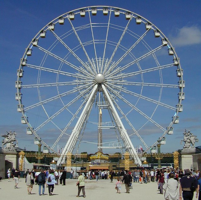
For the final window scene I had planned to have an amusement park with a spinning ferris wheel and a roller coaster shooting past the window. Unfortunately there aren't many fairgrounds around in the middle of November so I wasn't able to get any footage or images myself, so I turned to my good friend Mr. Google for help!

 |
| Image credit: http://www.flickr.com/photos/erichoward/ |
There are plenty of great images of ferris wheels on the Internet, many of which are reasonably high quality, but unfortunately many of them are from the wrong angle! A lot of the more suitable ones were of horrendous quality or in motion, with lots of tiny lines and flashing lights that proved a complete nightmare to try and cut out neatly. As much as I'd love to have a full-colour ferris wheel spinning in the background, I don't really think it's too practical.
A couple of results were of silhouetted wheels which gave me the bright idea of creating a vector illustration to use, which would be much more simple to achieve. There are a few really really nice ones on Google but they're terribly low quality so I may end up just resizing them and then re-tracing the image to clean it up.


Thursday, 24 November 2011
Second attempt with Roto Brush
I have absolutely no idea what was I (or it) was doing earlier, but the Roto Brush tool seems to be working absolutely fine now. How bizarre!
My second attempt was infinitely more successful. I ran into a few problems with the background — it's a very similar colour to the cow so it was difficult to keep the selection consistent and close to her body. It's pretty shoddy and the outline wobbles all over the place but I wasn't too terribly meticulous with my selection — I figured that seeing as half of the cow would be hidden behind the window it wouldn't matter too much if it was less than perfect.
After watching a few more tutorials and having another go with it I feel much more comfortable with how it works. When you start painting your first selection you create a sort of "key frame" that After Effects uses as a point of reference for the following frames. It then creates a "span" which extends 20 frames ahead of and 20 frames behind (assuming there are that many frames ahead of/behind your reference frame). This span uses the information from the reference frame to calculate the movement of the selection as the selected object moves around. You can scrub through and view After Effects' automatically generated selection and for the most part, it's pretty accurate. Minor adjustments can be made simply by re-painting your selection on each frame.

The Roto Brush span lives just above the main timeline — the key/reference point is marked with a yellow square and the frame span is shown by a grey rectangle and series of arrows extending in either direction away from the key frame. My reference point was at the very beginning of the clip, so my span only extends forward. The default is 20 frames but you can extend it as long as is required. In the case of large differences between frames (in a clip with a lot of movement) it is often better to draw a new reference point rather than allowing After Effects to calculate the selection automatically.
 Much like any other tool, the Roto Brush has a number of different parameters than can be used to really refine your selection. "Propagation" is quite complex and isn't something I delved in to, but it relates to how After Effects calculates the selection in each frame by tweaking things like pixel search radius.
The most interesting section for me were all the "refine matte" options. Much like Photoshop's "refine edges" function, it allows you to tweak the selection by smoothing, feathering and reducing the "wobbling" of your selection edges. Decontaminate colours does its best to remove traces of colour from the background seeping into your selection edges. For example if you had an object on a red background it would attempt to neutralize the leftover red tones from the edges of your object.


In the images above you can see how using decontaminate colours helped to trim excess pixels and neutralise the green tones from the edges of my cow — most notably on the neck.
I took the rotoscoped footage and scaled it down slightly before placing it on the background. I'm not too happy with the position of the cow — originally I wanted it more to the right of the shot but when I tried this the back end of the cow was obscured by the curtain. Seeing as the tail is where most of the movement is this resulted in it just looking like a static image, so I had to shunt it to the left a little so the tail would still be visible. I think I may try adding a second cow slightly off in the distance to the right of the window to bring the scene back into balance.
Fortunately the biggest problem area — the belly of the cow — is hidden by the window, meaning I don't need to worry too much about fixing that selection. Having said that there are some obvious problem areas I need to go back and refine — the neck and head of the cow and the tail. The tail was quite difficult to select owing to all the blurring in each frame but I think if I go back with a smaller brush I may be able to clean it up a little.
I also need to fix the unsteady camera. I don't own a tripod and had to balance my camera on a rickety wooden fence so there's a bit of jump in the footage. I think if I keyframe the position slightly to re-align everything in each frame it should be alright.
My second attempt was infinitely more successful. I ran into a few problems with the background — it's a very similar colour to the cow so it was difficult to keep the selection consistent and close to her body. It's pretty shoddy and the outline wobbles all over the place but I wasn't too terribly meticulous with my selection — I figured that seeing as half of the cow would be hidden behind the window it wouldn't matter too much if it was less than perfect.
After watching a few more tutorials and having another go with it I feel much more comfortable with how it works. When you start painting your first selection you create a sort of "key frame" that After Effects uses as a point of reference for the following frames. It then creates a "span" which extends 20 frames ahead of and 20 frames behind (assuming there are that many frames ahead of/behind your reference frame). This span uses the information from the reference frame to calculate the movement of the selection as the selected object moves around. You can scrub through and view After Effects' automatically generated selection and for the most part, it's pretty accurate. Minor adjustments can be made simply by re-painting your selection on each frame.
The Roto Brush span lives just above the main timeline — the key/reference point is marked with a yellow square and the frame span is shown by a grey rectangle and series of arrows extending in either direction away from the key frame. My reference point was at the very beginning of the clip, so my span only extends forward. The default is 20 frames but you can extend it as long as is required. In the case of large differences between frames (in a clip with a lot of movement) it is often better to draw a new reference point rather than allowing After Effects to calculate the selection automatically.
The most interesting section for me were all the "refine matte" options. Much like Photoshop's "refine edges" function, it allows you to tweak the selection by smoothing, feathering and reducing the "wobbling" of your selection edges. Decontaminate colours does its best to remove traces of colour from the background seeping into your selection edges. For example if you had an object on a red background it would attempt to neutralize the leftover red tones from the edges of your object.


In the images above you can see how using decontaminate colours helped to trim excess pixels and neutralise the green tones from the edges of my cow — most notably on the neck.
I took the rotoscoped footage and scaled it down slightly before placing it on the background. I'm not too happy with the position of the cow — originally I wanted it more to the right of the shot but when I tried this the back end of the cow was obscured by the curtain. Seeing as the tail is where most of the movement is this resulted in it just looking like a static image, so I had to shunt it to the left a little so the tail would still be visible. I think I may try adding a second cow slightly off in the distance to the right of the window to bring the scene back into balance.
Fortunately the biggest problem area — the belly of the cow — is hidden by the window, meaning I don't need to worry too much about fixing that selection. Having said that there are some obvious problem areas I need to go back and refine — the neck and head of the cow and the tail. The tail was quite difficult to select owing to all the blurring in each frame but I think if I go back with a smaller brush I may be able to clean it up a little.
I also need to fix the unsteady camera. I don't own a tripod and had to balance my camera on a rickety wooden fence so there's a bit of jump in the footage. I think if I keyframe the position slightly to re-align everything in each frame it should be alright.
Monday, 21 November 2011
Windmills: Photos and footage
Similarly to the previous post, I went hunting for windmills at the weekend! I was really hoping I could find one that was active and working so I could film it, but I wasn't able to locate one during my (admittedly brief) search.


Luckily there's a restored windmill about 15 minutes from my home in Kent which is actually open to the public during the summer months. Wind permitting, it's also active — sadly not the case in this instance. Regardless I think I can still make it work. I'm going to see if I can cut the sails out and put them onto a separate layer. I should then be able to animate them turning quite easily. The position of the sails is actually ideal for this as it reduces the amount of clone brushing I'll need to do to fill the gaps!


Luckily there's a restored windmill about 15 minutes from my home in Kent which is actually open to the public during the summer months. Wind permitting, it's also active — sadly not the case in this instance. Regardless I think I can still make it work. I'm going to see if I can cut the sails out and put them onto a separate layer. I should then be able to animate them turning quite easily. The position of the sails is actually ideal for this as it reduces the amount of clone brushing I'll need to do to fill the gaps!
Sunday, 20 November 2011
Cows: footage for animated background
Originally, for the cow in my animation, I was just going to chop up some photos of a toy cow and make puppets similar to the ones I've already done. After seeing how much they cost I soon changed my mind!
I then thought that, seeing as we need to have at least one animated backdrop in our animation, it would make more sense to go out and film a cow that I would then be able to use in the background. As a result I spent most of this weekend out shooting some footage.
I ended up shooting a lot more footage than this (almost 1GB in total) but decided against uploading all of it! I've sifted through all my clips and picked out the sections that I think I can use:
My camera's not terribly hi-res, but seeing as the cows will be fairly small I'm hoping it won't be too much of a problem.
I then thought that, seeing as we need to have at least one animated backdrop in our animation, it would make more sense to go out and film a cow that I would then be able to use in the background. As a result I spent most of this weekend out shooting some footage.
I ended up shooting a lot more footage than this (almost 1GB in total) but decided against uploading all of it! I've sifted through all my clips and picked out the sections that I think I can use:
My camera's not terribly hi-res, but seeing as the cows will be fairly small I'm hoping it won't be too much of a problem.
I'm hoping to cut the cow out of the background and composite it over the field beyond the window in the background of my animation. I'm planning on experimenting with After Effects' "Roto Brush" tool that I've heard very good things about. From what I understand so far it's a slightly more automated rotoscoping process that allows you to quickly cut parts of footage out from the background. It sounds like a very versatile tool and I'm hoping that there's enough distinction between the cows and the background for me to cut them out effectively.
(No practical use whatsoever, but I thought it was funny!)
Tuesday, 15 November 2011
After Effects 'Window Pain' scene test 1
Had a bit of fun and threw together a quick mockup of one of the scenes. It's very rough and by no means the final draft but it gave me a good idea of how the puppets and backdrops will work together.
The scene was very simply created by nesting the composition containing the walk cycle within the composition containing the backdrop. I then added keyframes on the position element of the walk cycle to have him walk across the screen. I need to figure out how to get the puppet to to stop moving once he reaches the end of the window!
Though the walk cycle is very rough and needs a lot of fixing, I actually quite like the sort of stomping effect it has as he leaves the room! It has its own charm to it.
Though the walk cycle is very rough and needs a lot of fixing, I actually quite like the sort of stomping effect it has as he leaves the room! It has its own charm to it.
It was a good, quick test to have done as it's really given me an idea of how After Effects works in terms of scene building. Once the pieces are all there, it's surprisingly easy to put something together!
After Effects walk cycle V3
Again keeping the keyframe spacing consistent and working with just one ground level for both feet. I also tried to make it a little less robotic by making the head bob up and down. I tried to keep the feet steady on the ground to improve the impression of weight as he walks. The front foot slips below the ground level on the "up" position which I really need to fix — looks a bit floaty. I also tried to drag the feet a bit and make them flop around to make them a little more lively. It's still iffy, but it's getting there! I think I probably need more space between each keyframe as it seems a little too quick.
Not terribly happy with the rear arm. It's pretty choppy but for some reason I found it difficult to animate accurately... then again it's been something I struggle with in any walk cycle! Perhaps because it's a direct copy of the front arm so it doesn't quite match up to the rest of the body when positioned behind. I probably need to completely re-make it.
The frame spacing might be a little too uniform. People's legs aren't exactly timed like this — some pick up their feet slower and drop them more quickly or vice versa. I might even try getting Craig to walk around a bit for me and try to replicate how he actually walks with the puppet!
After Effects walk cycle V2
I adjusted the spacing so that there were 4 frames between each keyframe. The limbs are now in sync and everything moves evenly! It's still very robotic and lacking in anything even vaguely resembling personality but I think the mechanics are there.
Having two floor levels — one for each foot — is really over complicating things. It's hard to animate the legs smoothly and I find myself getting confused as to which foot should land where. I think I'm going to make both feet level and just use one ground line to help keep things simple.
After Effects walk cycle V1
Experimenting some more with After Effects and its animation capabilities. I tried to make a walk cycle using my the second technique Jon showed us. I split my puppet into layers for each body part — e.g. sleeve, forearm, body, thigh, shin — and rounded out the tops of each limb to allow for smooth rotation. I adjusted the anchor points for each limb, placing them roughly where the joint would be, so that they rotated semi-realistically.
I made each layer a parent of its corresponding lower body parts so that when, for example, I rotated the thigh, the rest of the leg would follow.

Just by playing around and rotating each limb I can see where I need to make alterations to my puppet. There's a little excess on the thigh layer that pokes out when I rotate the shin so I need to trim that down a bit.

I'm quite pleased with the way the arm rotates. It works fairly nicely so luckily I don't need to make any alterations there.

Slightly stupidly I forgot to make a rear arm for the puppet. I simply duplicated the front arm and flipped the sleeve/forearm and tucked it underneath the body layer. It's not brilliant but for all intents and purposes, it works!

The foot layer needs rounding out a the top so that it doesn't suddenly cut off whenever I rotate it. In an attempt to give the puppet some depth I made his rear leg slightly smaller and higher up, so I placed a couple of guides on the canvas to help designate both ground levels for each foot.
For a first attempt it didn't come out too badly. It's a little robotic and I think the bounce might be too much, but it works. Somehow I managed to completely screw up the keyframe placement/spacing so that the timing is all over the place. One step is much quicker than the other as a result. Fortunately I've discovered the glory that is the "move forward/backward one frame" shortcut (Cmd + right/left arrow) so next time I will be able to ensure the keyframes are evenly spaced.
After Effects' auto-inbetweening isn't terribly accurate — it doesn't know that I'm trying to animate a walk cycle, so it simply takes the most straightforward path from one keyframe to another. This results in the puppet floating all over the place as he walks. I was slightly able to rectify this by manually adjusting the rotation and position of the body/feet to help keep it anchored to the floor but it's still not terribly accurate. I need to see if there's a way to keep the feet anchored to the floor?
Nonetheless I'm much more comfortable with this way of working. It allows much more control over the movement than the puppet pin does. With a little time and patience I think I can get a walk cycle that looks halfway decent!
I made each layer a parent of its corresponding lower body parts so that when, for example, I rotated the thigh, the rest of the leg would follow.

Just by playing around and rotating each limb I can see where I need to make alterations to my puppet. There's a little excess on the thigh layer that pokes out when I rotate the shin so I need to trim that down a bit.

I'm quite pleased with the way the arm rotates. It works fairly nicely so luckily I don't need to make any alterations there.

Slightly stupidly I forgot to make a rear arm for the puppet. I simply duplicated the front arm and flipped the sleeve/forearm and tucked it underneath the body layer. It's not brilliant but for all intents and purposes, it works!
The foot layer needs rounding out a the top so that it doesn't suddenly cut off whenever I rotate it. In an attempt to give the puppet some depth I made his rear leg slightly smaller and higher up, so I placed a couple of guides on the canvas to help designate both ground levels for each foot.
For a first attempt it didn't come out too badly. It's a little robotic and I think the bounce might be too much, but it works. Somehow I managed to completely screw up the keyframe placement/spacing so that the timing is all over the place. One step is much quicker than the other as a result. Fortunately I've discovered the glory that is the "move forward/backward one frame" shortcut (Cmd + right/left arrow) so next time I will be able to ensure the keyframes are evenly spaced.
After Effects' auto-inbetweening isn't terribly accurate — it doesn't know that I'm trying to animate a walk cycle, so it simply takes the most straightforward path from one keyframe to another. This results in the puppet floating all over the place as he walks. I was slightly able to rectify this by manually adjusting the rotation and position of the body/feet to help keep it anchored to the floor but it's still not terribly accurate. I need to see if there's a way to keep the feet anchored to the floor?
Nonetheless I'm much more comfortable with this way of working. It allows much more control over the movement than the puppet pin does. With a little time and patience I think I can get a walk cycle that looks halfway decent!
Sunday, 13 November 2011
More puppets and pin tests
Did a little more work on my character puppets. I've attempted to clean up the poor quality image on the front-facing head, but I think it's a lost cause. I mirrored the eye and cleaned up the whites a little bit which I definitely think helped but I reckon it's better just to get some new pictures. Something closer up (in better lighting conditions and a decent camera) with bigger eyes in order to help show expression would be good. Ideally I'd like to be able to take the eyebrows and have them on a separate layer so they'll be easier to animate. Perhaps I could even erase them and draw them back in?

Also made a rear facing puppet which I feel looks a bit shoddy. I'm fairly happy with the body, I think it's just the heads on all of the puppets that are bothering me. I'm seeing Craig again this week so hopefully I'll be able to get some better pictures for the head...
I wanted to see how well the puppets worked with the puppet tool and decided to just play around and see what happens. It came out horrendously. I kind of wanted to see if I could do a curtain-closing-type action, but the arm movement is too slow (easily fixed by adjusting keyframes) and the hands need to be changed as well, so they look like they're actually grasping the curtains. I need to try and work out how to replace them with a new image.
Granted, I didn't spend very much time on it, but the puppet tool is just so heinously difficult to work with. I'm doubtful that I'll really be able to put it to any use. I really can't get to grips with the way it works — the movement is very limited. Ideally I'd like to use it just for the legs to give them a sort of 'rubber hose' effect like in the British Gas adverts, but it'd be pretty pointless seeing as you don't see my character's legs for half of it. I think it would just be easier to split my puppet into layers and animate them manually, using anchor points and rotation keyframes. Still, I won't discard the idea completely and I'll certainly keep playing around with it.
Saturday, 12 November 2011
Animatic — second draft
Little hesitant to call this an animatic as it's lacking a lot of movement — it's more a storyboard to sound than anything! It does serve a purpose in terms of checking timings and sound and whatnot.
I think some of the timings look a little odd with the static images — especially where he stands up and walks out of the room. I did actually record myself acting out that specific part several times. I tried to match up the stills with the average timing from the recording but it looks a bit weird. I'm hoping that once it's actually got all the movement in there it might look better!
I'm quite pleased as it all seems to fit comfortably into 40 seconds without me needing to trim anything, but it's still only a rough draft and I'm preparing for the fact that it could overrun when it comes to the final edit.
The "chat bubble" was really quickly put together using a rounded rectangle mask with a 3px stroke and pale blue fill. The animation was a simple keyframe job on the opacity and position elements. The "Craig" text at the top was set as a child object of the bubble so that it would track the movement and drift up in sync with the bubble. The chat text itself was a simple animation preset "typewriter" effect. I then keyframed the opacity from 100% to 0% to have it appear to fade out. If I'm feeling really clever I might even try to sync up the keyboard sounds to the text as it is typed!
I'm really not sure about the whole chat bubble idea though. It was something I came up with as a way to get Craig's most used phrase and some animated text in there, but I think it's a little distracting? I may just stick with animating the text on the title card.
I'm quite pleased with how it's turned out technically (though there are a couple of problems with the sound sync) but in terms of the actual idea I'm still feeling a bit wobbly. I'm just a bit worried that I've gone in the wrong direction with the whole thing...
Saturday, 5 November 2011
After Effects tutorial day 3
We seem to have covered masses today; from animation in Photoshop to basic masking tools in After Effects. I'm very familiar with Photoshop's frame animation interface already, but I'd never understood the timeline panel so it was great to finally get to grips with that!
We covered exporting image sequences in Photoshop both as JPEGs and PNGs to preserve transparency. We were then shown how to import these into After Effects correctly. Image sequences themselves are exactly that — still images with no frame rate assigned to them. As a result After Effects will usually default to playing them back at 30fps, regardless of your composition settings. To rectify this you need to change the image sequence's "interpret footage" settings.


After we'd successfully imported our animations we were introduced to masks, which work very much the same way as they do in Photoshop. By drawing and creating vector shapes you're effectively "masking off" the area within that shape. You can set a mask to be additive or subtractive — this basically means whether it shows or hides whatever is within the confines of that shape.
I used a simple eliptical mask filled with black to create a shadow for my jumping frog:
I added a slight feathering to the mask to give the shadow a softer edge. I used two or three keyframes to mark the shadow's size when the frog was at the highest and lowest points — to make it smaller and larger, respectively.
As another example we were shown how to use a subtractive mask to remove the Mona Lisa image from its frame, replacing it with a "keep calm and carry on" image. It's also possible to animate masks — they have properties that can be keyframed, just like everything else.
I drew a simple subtractive mask to remove the Mona Lisa from her frame, and then keyframed the mask path from right to left to give it a "wipe" effect. The text was another, slightly feathered "additive" mask that started very small (hiding all the text from sight) keyframed to gradually expand, revealing the text.
We were then shown something much cooler:
By nesting the frame and the keep calm image inside their own composition (effectively acting as flattening them into one layer) we were able to apply a circular additive mask (revealing only that within the circle) to act as a spotlight. By keyframing the mask path we were able to make it appear as a spotlight searching around — when the "light" hit the centre, we could simply keyframe the mask expansion property to scale the mask up, revealing the entire image.
I'm really happy with the outcome of this lesson. Masks are an incredibly dynamic way of working and, with a little creativity, it greatly negates the need for using Photoshop to make quick adjustments.
We covered exporting image sequences in Photoshop both as JPEGs and PNGs to preserve transparency. We were then shown how to import these into After Effects correctly. Image sequences themselves are exactly that — still images with no frame rate assigned to them. As a result After Effects will usually default to playing them back at 30fps, regardless of your composition settings. To rectify this you need to change the image sequence's "interpret footage" settings.
I used a simple eliptical mask filled with black to create a shadow for my jumping frog:
I added a slight feathering to the mask to give the shadow a softer edge. I used two or three keyframes to mark the shadow's size when the frog was at the highest and lowest points — to make it smaller and larger, respectively.
As another example we were shown how to use a subtractive mask to remove the Mona Lisa image from its frame, replacing it with a "keep calm and carry on" image. It's also possible to animate masks — they have properties that can be keyframed, just like everything else.
I drew a simple subtractive mask to remove the Mona Lisa from her frame, and then keyframed the mask path from right to left to give it a "wipe" effect. The text was another, slightly feathered "additive" mask that started very small (hiding all the text from sight) keyframed to gradually expand, revealing the text.
We were then shown something much cooler:
By nesting the frame and the keep calm image inside their own composition (effectively acting as flattening them into one layer) we were able to apply a circular additive mask (revealing only that within the circle) to act as a spotlight. By keyframing the mask path we were able to make it appear as a spotlight searching around — when the "light" hit the centre, we could simply keyframe the mask expansion property to scale the mask up, revealing the entire image.
I'm really happy with the outcome of this lesson. Masks are an incredibly dynamic way of working and, with a little creativity, it greatly negates the need for using Photoshop to make quick adjustments.
Tuesday, 1 November 2011
After Effects tutorial day 2
The second After Effects tutorial was largely a recap of the first session. We revisited a lot of techniques from last week and were shown how to utilise them in a different way. The biggest difference is that last week, we were provided with video footage and simply compiled it together; today we had to create movement using static images.
We looked at importing and working on PSD files within After Effects in a little more detail; we were shown how to keyframe individual attributes on each layer. We were able to animate the wheels on the quad bike simply by keyframing the rotation on each wheel layer. By providing a start and end point, After Effects calculates the difference between the frames and creates simple in-betweens automatically.
Because the wheels were separate layers from the body of the quad bike, we were only able to move each layer independently which caused some problems with key framing. The solution is to make the wheel layers "children" of a parent object — in this case, the quad bike. It works similarly to linking layers in Photoshop. Whatever the parent object does, the child follows. This allowed us to move the layers as one object.
The only trouble is that parenting objects resets the anchor point so that it scales and rotates from the centre of the object. This is no good for a wheelie; we wanted it to rotate from the rear wheel. We were shown how to create a null object (literally, nothing) which would act as a new anchor point.
Unfortunately my After Effects knowledge is still limited so it's pretty crude!
I simply used a couple of keyframes on the quad bike's wiggle effect parameters to make it go a bit crazy before the wheel flies off. The wheel's path was, again, a simple keyframe job on the "position" attribute. I tried to adjust the scale of it as it moved along the path to give it a little bit of squash and stretch, but it isn't terribly noticeable as it moves too quickly.
I followed a tutorial for the sparks — they were surprisingly easy and created using a 'CC Particle World' filter, with only minor adjustments to the basic settings required. Though I don't fully understand all the options the effect I was able to gain a basic understanding of how it works just by playing with the parameters. They're all fairly self-explanatory — things like velocity, gravity, birth rate, etc. The birth rate was keyframed gradually down to 0 to give the effect that the sparks were falling and diminishing.
We looked at importing and working on PSD files within After Effects in a little more detail; we were shown how to keyframe individual attributes on each layer. We were able to animate the wheels on the quad bike simply by keyframing the rotation on each wheel layer. By providing a start and end point, After Effects calculates the difference between the frames and creates simple in-betweens automatically.
Because the wheels were separate layers from the body of the quad bike, we were only able to move each layer independently which caused some problems with key framing. The solution is to make the wheel layers "children" of a parent object — in this case, the quad bike. It works similarly to linking layers in Photoshop. Whatever the parent object does, the child follows. This allowed us to move the layers as one object.
The only trouble is that parenting objects resets the anchor point so that it scales and rotates from the centre of the object. This is no good for a wheelie; we wanted it to rotate from the rear wheel. We were shown how to create a null object (literally, nothing) which would act as a new anchor point.
Unfortunately my After Effects knowledge is still limited so it's pretty crude!
I simply used a couple of keyframes on the quad bike's wiggle effect parameters to make it go a bit crazy before the wheel flies off. The wheel's path was, again, a simple keyframe job on the "position" attribute. I tried to adjust the scale of it as it moved along the path to give it a little bit of squash and stretch, but it isn't terribly noticeable as it moves too quickly.
I followed a tutorial for the sparks — they were surprisingly easy and created using a 'CC Particle World' filter, with only minor adjustments to the basic settings required. Though I don't fully understand all the options the effect I was able to gain a basic understanding of how it works just by playing with the parameters. They're all fairly self-explanatory — things like velocity, gravity, birth rate, etc. The birth rate was keyframed gradually down to 0 to give the effect that the sparks were falling and diminishing.
Sunday, 30 October 2011
Polished storyboards
I actually finished these about a week ago, but for some reason I've only just gotten around to uploading them. Whoopsie!


They're a bit iffy but it's mostly all there! Drawing these flagged up quite a few problems with the initial composition in some of the shots, mostly in the position of the window behind Craig. It was a bit too low initially so when he sat at his desk his head blocked most of the view, meaning you wouldn't have been able to see what was going on outside. There's a couple of problems with the desk as well — when Craig goes to shut the curtains he overlaps the desk with his leg a bit. I've managed to sort-of rectify this by shifting it to the right a little bit but it could do with some further tweaking. I might need to rethink the set placement again if it proves to be too much of an issue, but so far I think this will work. My next aims are to finish my final puppets and put together a better animatic with sound, which should give me a much clearer indication as to the length.


They're a bit iffy but it's mostly all there! Drawing these flagged up quite a few problems with the initial composition in some of the shots, mostly in the position of the window behind Craig. It was a bit too low initially so when he sat at his desk his head blocked most of the view, meaning you wouldn't have been able to see what was going on outside. There's a couple of problems with the desk as well — when Craig goes to shut the curtains he overlaps the desk with his leg a bit. I've managed to sort-of rectify this by shifting it to the right a little bit but it could do with some further tweaking. I might need to rethink the set placement again if it proves to be too much of an issue, but so far I think this will work. My next aims are to finish my final puppets and put together a better animatic with sound, which should give me a much clearer indication as to the length.
Friday, 28 October 2011
Title cards planning & research
Trying to figure out a design for a title card — I love the style of the title cards in old Hanna-Barbera cartoons, particularly Tom & Jerry which had some really beautiful art. I've been looking at some of those for some inspiration in terms of colours and composition.

Tom & Jerry's title cards were often quite simple with flat colour or two-tone backgrounds. Characters, when used, were often silhouetted against the backdrop.


Some cartoons, such as Dick Dastardly & Muttley in Their Flying Machines, would use the same title card artwork for each episode.

 Chip 'n' Dale didn't even have a card at all — the episode title was
simply displayed during the establishing shot. This would definitely be
something to consider in the event that having a static title card
causes me to go over time.
Chip 'n' Dale didn't even have a card at all — the episode title was
simply displayed during the establishing shot. This would definitely be
something to consider in the event that having a static title card
causes me to go over time.


Quick brainstorm for some potential titles to use. Titles are something I always struggle to come up with, but I think I've finally hit on the delightfully cheesy "Window Pain." (Oh, that's terrible…)


I don't want to get too extravagant with it at this point. A good title card is important, but I'm not going to fret too much over it at this stage. I don't really want to spend hours on it only to discover that oops, my animation's 55 seconds long. |f everything slots together comfortably and I have time left at the end, I may go back and tart it up a bit. But I think it's functional at this stage.

Tom & Jerry's title cards were often quite simple with flat colour or two-tone backgrounds. Characters, when used, were often silhouetted against the backdrop.
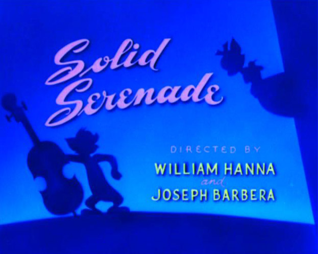
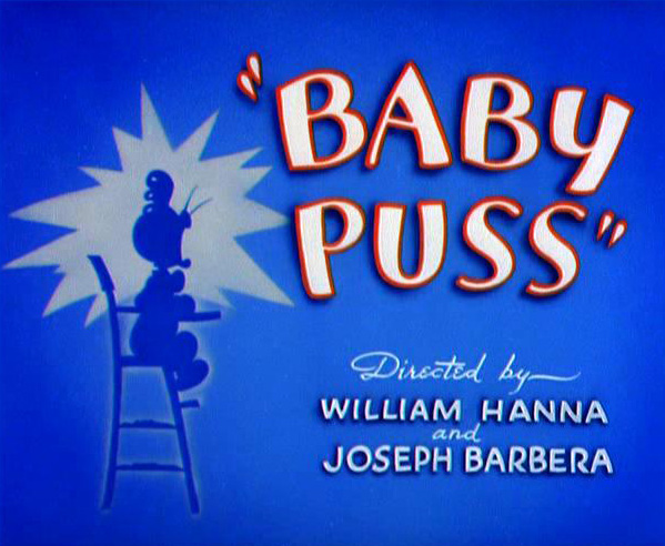

The majority of title cards seemed to be predominantly blue or green.
I'm not entirely sure why — was it a stylistic choice or more to do with
production limitations? There were a small number of cards that were
warmer in hue, but they seemed to be much simpler in composition with
little to no artwork at all. Notably, the title card for "Push Button
Kitty" was a simple orange radial gradient with just the episode title
and production credits.

Some cartoons, such as Dick Dastardly & Muttley in Their Flying Machines, would use the same title card artwork for each episode.


Quick brainstorm for some potential titles to use. Titles are something I always struggle to come up with, but I think I've finally hit on the delightfully cheesy "Window Pain." (Oh, that's terrible…)

I love the simple composition of the FairlyOdd Parents and Tom &
Jerry's cards and it's something I'd like to integrate into my own work.
I'm planning on a very limited palette — black or navy blue, with white
text.

I don't want to get too extravagant with it at this point. A good title card is important, but I'm not going to fret too much over it at this stage. I don't really want to spend hours on it only to discover that oops, my animation's 55 seconds long. |f everything slots together comfortably and I have time left at the end, I may go back and tart it up a bit. But I think it's functional at this stage.
Subscribe to:
Posts (Atom)