Showing posts with label sketchbook. Show all posts

Friday, 28 October 2011

Title cards planning & research

Trying to figure out a design for a title card — I love the style of the title cards in old Hanna-Barbera cartoons, particularly Tom & Jerry which had some really beautiful art. I've been looking at some of those for some inspiration in terms of colours and composition.


Tom & Jerry's title cards were often quite simple with flat colour or two-tone backgrounds. Characters, when used, were often silhouetted against the backdrop.
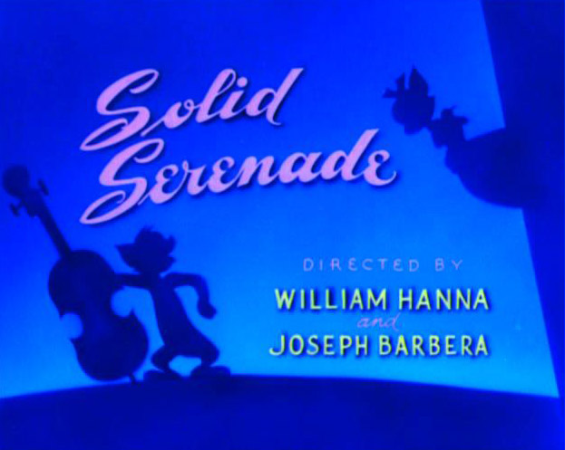
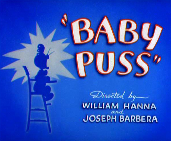
The majority of title cards seemed to be predominantly blue or green. I'm not entirely sure why — was it a stylistic choice or more to do with production limitations? There were a small number of cards that were warmer in hue, but they seemed to be much simpler in composition with little to no artwork at all. Notably, the title card for "Push Button Kitty" was a simple orange radial gradient with just the episode title and production credits.


Some cartoons, such as Dick Dastardly & Muttley in Their Flying Machines, would use the same title card artwork for each episode.


Chip 'n' Dale didn't even have a card at all — the episode title was simply displayed during the establishing shot. This would definitely be something to consider in the event that having a static title card causes me to go over time.


Quick brainstorm for some potential titles to use. Titles are something I always struggle to come up with, but I think I've finally hit on the delightfully cheesy "Window Pain." (Oh, that's terrible…)


I love the simple composition of the FairlyOdd Parents and Tom & Jerry's cards and it's something I'd like to integrate into my own work. I'm planning on a very limited palette — black or navy blue, with white text.


I don't want to get too extravagant with it at this point. A good title card is important, but I'm not going to fret too much over it at this stage. I don't really want to spend hours on it only to discover that oops, my animation's 55 seconds long. |f everything slots together comfortably and I have time left at the end, I may go back and tart it up a bit. But I think it's functional at this stage.

Sunday, 16 October 2011

Rough storyboards and animatic test

Chatted to Andy on Friday about my ideas so far and it was generally pretty positive, so I'm pleased about that! The only thing that struck me afterwards is that my idea was composed of one long, continuous shot as opposed to containing 5 cuts as specified in the brief. This caused me a bit of panic at first as I wasn't sure how I'd be able to work in different camera angles without losing the visual gags. Luckily, after some experimentation, I was able to combine the cuts of an earlier idea with the current narrative structure with some success. This is what I ended up with:

Click for full size

This is by no means the finished storyboard — I'm working on that right now — I really just want to do as many thumbnails as possible to allow me to jiggle things around and explore every which way before starting something mor refined.

The other thing I was concerned about was the length; the very last thing I want is to discover at the last possible minute that I've way overshot the mark. I used the very finest tools (my webcam and Windows Movie Maker) to craft this elaborate animatic:


An Oscar winner to be sure!!

This is clearly only a tentative animatic (if you can call it that) — I'll be producing a much cleaner one later — I just wanted to give myself a rough idea of the length. I doubt it's completely accurate but at least I know that, at this point, I'm safely within the time constraints. If, by the time of the completed animation, I find that it's too long, I can safely cut one of the scenes and still have a coherent narrative.

Wednesday, 12 October 2011

Character design ideas

I did some more quick sketches of Craig from the photos I took to try and get more of a feel for his character — posture, face shape etc so I could start trying to figure out something of a character design.


None of these feel "right" to me — then again they're only quick pencil sketches, so it's difficult to envision how the characters and backgrounds might work together. I think it might help if I start using more colour and different materials to create mock ups of certain scenes, to demonstrate and give me an idea on how certain elements will work together.

I think maybe I'm worrying too much. All I really want in terms of a character is a little puppet-Craig, so I don't need to go completely crazy — I think I can probably get away with chopping some photographs together, maybe on some sort of drawn or edited body?

I started thinking about rotoscoping and how that might look so I did some quick traces of a couple of the photos to see how that might work.


I don't know. I think they look okay but it's not really what I'm going for. I can't see them working as animated characters. They're too stiff I think, especially compared with the sort of backdrops I'm trying to use.

I've asked Craig to send me some of his drawings that I can make puppets out of as background characters!

Saturday, 8 October 2011

Character design materials

Met up with Craig on Thursday to have a quick catch-up. We have frequently conflicting timetables and he doesn't live on-campus so it's been quite difficult to find a time that we're both in and available! 

I was initially apprehensive about how he'd respond to the complete 180 I'd pulled regarding my ideas, but to my great relief he seemed quite enthusiastic about everything and was very keen on the balloon in space scene. 
We had a brief amount of time before the afternoon's lecture so I was able to get some quick snapshots and drawings done so that I can start moving forward with character design.


(Sorry for the horrible quality thumbnails — Blogspot's not very good at this sort of thing)


(Click below for a few more pictures)

Sunday, 2 October 2011

Quick ideas

Got a lot of ideas in my head in terms of visuals, so I've started throwing some things at my sketchbook and seeing what happens. I'm trying to translate all this from sketchbook scribbles and make it slightly more coherent, so bear with me!

I'd really like to apply some of what we've been learning in animation principles — my first thought was just to have the character walking across some sort of scrolling panoramic background. In keeping with the theme of fairytales, I'm loosely thinking of a forest or some sort of castle.
I'd like to do something in a very ornate, classic style like old book illustrations — perhaps even using sepia tones and old paper textures to really replicate the feel of a children's story.

One possible idea I'm toying with is to have the title card look like the cover of an old book, with the title of the animation embellished in gold lettering (as very poorly illustrated here), then have the book open to reveal a story, which then begins to come to life across the pages.

Thinking in terms of a pop up book — each time the page turns they kind of spring upwards from the page. Their movement would be intentionally kept very 'puppety' and articulated.

I then got to thinking that it would probably make sense for things to take place in Holland — Craig's listed 'favourite or special place.' I started thinking a bit about how I might best portray Holland visually, and ended up resorting to some very sophisticated stereotypes. Windmills and tulips!


I'm already pretty much decided that I need to use a windmill in here somewhere, probably as my animated background element. I'm thinking I'll either try to find a windmill to film for some footage, or (more likely) create a simple cutout puppet from a magazine image or drawing.


I'm still trying to generate ideas. A lot of the things Craig said to me are related to one another, but trying to string them together into something cohesive is quite a challenge.