Showing posts with label Photoshop. Show all posts

Sunday, 4 December 2011

New puppet and updated backdrop


I took some better pictures of Craig and updated my puppet with the new head. I'm much, much happier with how this looks. It's a lot cleaner now! I'm hoping to find a way to get the eyebrows neatly onto a separate layer so I can animate some better facial expressions. Cutting the eyebrow out is no problem — it's repairing the skin underneath that's proving tricky...


I also tweaked the background some more, adding a few more posters to make it a little less bare. I'm not sure I like it — seems a bit cluttered — but it's got a bit more flavour to it now. The poster on the far left was a happy accident — it just so happened to contain Craig's most used word! There was one that said "Hello, how are you?" in a multitude of different languages but it was really badly designed. I may make one of my own and put it there instead. Then at least I've still got his quote in there if the chat bubble doesn't work out.

Saturday, 3 December 2011

Paris scene — French couple

For the Paris scene I needed to somehow create a stereotypical French couple embracing. I was really dreading having to do this and have admittedly been putting it off for a while, as I hadn't a clue how I was going to do it! I ended up using similar techniques to how I created my Craig puppet and simply stitched together a bunch of photographs from Google.


I started with an image of a couple of ballroom dancers as the pose was quite similar to the sort of thing I wanted.

I began with this:

(I love this — it's so hilariously awful)


And finished with this:


I lost count of how many pictures I robbed off Google to put this together. The hands on the woman are really shoddy but they're probably going to be hidden behind the window frame so it hopefully shouldn't matter too much. I may go back and tweak them a bit — they're really bothering me!

I'm not totally done with this yet — still got a fair bit of tweaking to do, mainly on the woman. The hair and coat are bothering me and she just feels incomplete somehow. I'm not sure about the colours either.

I think it's the face as well — it's had virtually no editing to it. I think it's because the man is so ridiculously stereotypical whereas she's fairly ordinary, so it looks a little out of place. Maybe I'll darken her hair, give her ridiculously pale skin and bright red lips and a huge pair of sunglasses. For some reason French women are harder to caricature!

(What is it with me and French people?!...)

Thursday, 1 December 2011

Vector ferris wheel

I found this one on Google, but again it was really low quality. I blew it up by about 200% (look at the lovely JPEG artifacts!) and started to trace over it — this gives me the benefit of separating each part into layers for me to animate!


It's really quick and pretty shoddy but I figured since it's going to be in the distance, much like the cows, it shouldn't matter too much. It was a really simple pen tool job to which I simply applied stroke paths of varying thicknesses. The wheel itself is on the bottom layer, the carts are on another layer and the weird girder thing is on the top layer. This will allow me to parent the carts to the wheel and mimic the rotation as it spins.

I didn't notice at first but I think the image of the ferris wheel that I used is actually a stock image — whoops. I honestly wasn't aware — I nabbed it off another website which had taken the thumbnail from a stock image resource. Serves me right for not checking my sources!

I'm a bit concerned now and I probably shouldn't use it in my final film, however seeing as I've gone to the trouble of resampling the image I think it'll be alright to use it just for this one test? I'll probably just have to re-do it from scratch for use in the final animation.

Saturday, 5 November 2011

After Effects tutorial day 3

We seem to have covered masses today; from animation in Photoshop to basic masking tools in After Effects. I'm very familiar with Photoshop's frame animation interface already, but I'd never understood the timeline panel so it was great to finally get to grips with that!

We covered exporting image sequences in Photoshop both as JPEGs and PNGs to preserve transparency. We were then shown how to import these into After Effects correctly. Image sequences themselves are exactly that — still images with no frame rate assigned to them. As a result After Effects will usually default to playing them back at 30fps, regardless of your composition settings. To rectify this you need to change the image sequence's "interpret footage" settings.


After we'd successfully imported our animations we were introduced to masks, which work very much the same way as they do in Photoshop. By drawing and creating vector shapes you're effectively "masking off" the area within that shape. You can set a mask to be additive or subtractive — this basically means whether it shows or hides whatever is within the confines of that shape.

I used a simple eliptical mask filled with black to create a shadow for my jumping frog:


I added a slight feathering to the mask to give the shadow a softer edge. I used two or three keyframes to mark the shadow's size when the frog was at the highest and lowest points — to make it smaller and larger, respectively.

As another example we were shown how to use a subtractive mask to remove the Mona Lisa image from its frame, replacing it with a "keep calm and carry on" image. It's also possible to animate masks — they have properties that can be keyframed, just like everything else.


I drew a simple subtractive mask to remove the Mona Lisa from her frame, and then keyframed the mask path from right to left to give it a "wipe" effect. The text was another, slightly feathered "additive" mask that started very small (hiding all the text from sight) keyframed to gradually expand, revealing the text.

We were then shown something much cooler:


By nesting the frame and the keep calm image inside their own composition (effectively acting as flattening them into one layer) we were able to apply a circular additive mask (revealing only that within the circle) to act as a spotlight. By keyframing the mask path we were able to make it appear as a spotlight searching around — when the "light" hit the centre, we could simply keyframe the mask expansion property to scale the mask up, revealing the entire image.

I'm really happy with the outcome of this lesson. Masks are an incredibly dynamic way of working and, with a little creativity, it greatly negates the need for using Photoshop to make quick adjustments.

Thursday, 3 November 2011

Update on character puppets


Had a go at the hands; very heavily British Gas inspired but I think they work!

I'm not quite sure about the side puppet. Something about it looks off to me — I think it's the head and neck. Actually, something about the head on both puppets bothers me. I think it just looks a little out-of place with the relatively illustrative-style body. I need to find a way to preserve its photographic-ness (is that even a word?) whilst keeping it fitting with the style of the body. I'm utterly clueless though.

Still... progress!

Finalised character design


Working on my final puppets for the animation. I looked a little more closely at the British Gas TV adverts to better give me an idea on how to construct the body. I took a lot of new photos of Craig (against a white wall to make it easier to cut them out) and simply drew out some simplified body shapes using Photoshop's pen tool. I copied sections of his clothing and skin and pasted them into the shapes in order to give the clothes and arms a bit of texture.

I think the legs are quite plain looking, but unfortunately in the images the trousers and shoes came out very dark with no obvious texture, so I may have to pilfer some stock images in order to rectify that. I may try making them more of a dark grey as opposed to pitch black.

I'm quite pleased with how the puppets are looking so far. I still have some minor adjustments to make, such as lighting and shadows (especially on the shirt's collar), but otherwise I think I'm mostly there. I'm not entirely sure how to go about making the hands yet. I've been playing around with them but I can't seem to get anything that looks quite right.

I'm a little concerned about the image quality, especially on the face. My camera isn't particularly high resolution and I didn't think to turn the flash on so some of the pictures are a little grainy. I don't think it's too noticeable, especially when the puppets are scaled down to screen resolution, but I'm going to see if there's anything I can do to clean them up in Photoshop a little bit. Failing that I may have to re-shoot some of the images under better lighting conditions, or using a better camera.

Sunday, 30 October 2011

Polished storyboards

I actually finished these about a week ago, but for some reason I've only just gotten around to uploading them. Whoopsie!


They're a bit iffy but it's mostly all there! Drawing these flagged up quite a few problems with the initial composition in some of the shots, mostly in the position of the window behind Craig. It was a bit too low initially so when he sat at his desk his head blocked most of the view, meaning you wouldn't have been able to see what was going on outside. There's a couple of problems with the desk as well — when Craig goes to shut the curtains he overlaps the desk with his leg a bit. I've managed to sort-of rectify this by shifting it to the right a little bit but it could do with some further tweaking. I might need to rethink the set placement again if it proves to be too much of an issue, but so far I think this will work. My next aims are to finish my final puppets and put together a better animatic with sound, which should give me a much clearer indication as to the length.

Tuesday, 18 October 2011

Background mockups

Spent mos of today putting together some experimental backdrops. I'm relying mostly on Google Images and sxc.hu for all the pieces; the selection of hi-res stock images is horrifically limited, making it quite difficult to find parts that all fit together.

Click for full size

Click for full size

These are really just mockups to test composition. I still need to add some missing objects, background details and make a lot of lighting adjustments but I think I'm beginning to get something workable!

Thursday, 13 October 2011

Quick 'n' dirty puppet tests


Knocked together a couple of very quick and rough puppet test ideas. Going for something of an Angela Anaconda vibe. I'm not too keen — not quite sure what but something just bothers me. I think it's because at this stage I still don't really know what I'm aiming for in terms of character design. Its difficult to do anything satisfactory when you lack a clear idea of what you want.

At least I'll have something to practice with in tomorrow's lesson, though. Maybe seeing things in motion will give me some ideas.

Tuesday, 11 October 2011

Keep out sign

Click for full size
Bit of fun with Photoshop in this week's lesson; mostly just getting to grips with selection tools, brushes, text and layer styles. I downloaded a couple of grunge brushes and used them to rough things up a bit. May have gone a bit over the top! 

The doodles (and shamefully traced Godzilla) were done using a brush I downloaded quite some time ago designed to mimic the effect of a pencil. It's one of my favourite brushes for drawing because it's nice and textured!

Sunday, 2 October 2011

Digital Skills: Backdrop experimentation

Been doing a bit of tinkering with Photoshop, taking some inspiration from the works of Lewitt-Him and Alice/Martin Provensen. I wanted to see whether I could produce a similar effect to their simplistic cutout style using digital techniques.

Click for larger view
Not altogether too happy with it. I'm fairly pleased with the trees and grass and general scenery, but I really lost my groove on the house, which came out horrendously. There was a lot of detail that was difficult to break down and I was starting to get really impatient with some technical issues (read: Photoshop throwing up an "unrecoverable error" at me every 10 minutes), so I ended up really rushing it!

I thought that having quite bold and simplistic backdrops could work quite well if I was to have quite detailed character puppets, helping to bring focus to the scene. I think the colours could stand to be a little more subdued. Though I used a relatively limited pallette it's almost quite garish and potentially distracting. Lowering the opacity might help as opposed to completely re-colouring the entire scene.


The image was quite simple (if a little time consuming) to create — the original image (above) was sourced from sxc.hu, a free stock image resource. Ordinarily, I would prefer to go out and source my own images to use, but for the purposes of a spontaneous experiment it didn't really seem worth a trip to Holland ;] Retrospectively I could have used almost any image but I thought I'd try and keep with the theme of the project!

First I applied a Poster Edges filter to the image. This was to darken existing contrast boundaries and help Photoshop detect the edges of each object in the image when it came to the selection process.
 I then increased the brightness and contrast very slightly — again, to help with edge detection.
The cutout filter is one usually best avoided — in this instance, though, I found its use acceptable in order to help simplify the colours and shapes in the image, providing me a solid guideline to work from.
I then duplicated the background layer and applied a Find Edges filter to the copy. This gave a strong, distinct outline to everything in the image.
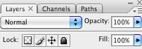
Unfortunately, in doing so, it also loses its colour information. Ideally I need the guidelines and the simplified colours/shapes from the previous layer, so I applied a Soft Light blend mode to remove the white from this layer and overlay it onto the one below.


The result is this fairly ugly but very useful image. It contains both the outlines from find edges and the simplified colours and shapes from the cutout filter, providing a perfect guide to paint over.

Because of the clear colour and edge distinction, I was able to simply use the magnetic lasso tool to make a loose selection around any area in the image. Photoshop was able to very accurately detect the edges of whatever I was selecting and mostly guided itself.
I could then just fill the selection with my chosen colour.

Friday, 30 September 2011

Photoshop introduction

At the end of our Photoshop introduction today, we were set a quick task to raid Google images and create a collage of what we're doing this weekend to ensure we'd taken everything on board and were comfortable using the selection tools we'd been shown. I present the fruits of my labour...

Click for full size

On Saturday I'm going to Guildford for shopping and excitement! On Sunday, I'll be saving the world and probably phoning my mum. When I'm around, party time is all the time.

See below for notes from today if you're interested in that kind of thing!